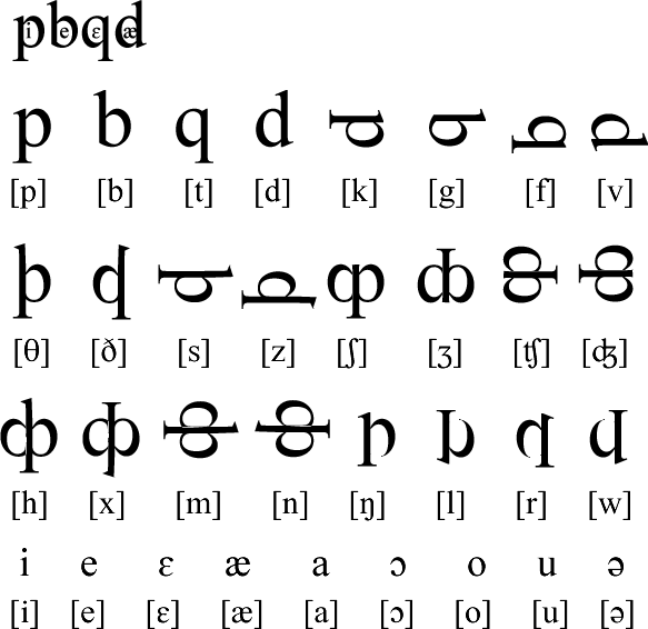
Here’s a script, called Pibeqɛdæ, that I constructed this afternoon based on the letter p, mainly. It has most of the phonemes used in English, and could be further extended. I put it together just to demonstate to a visitor to Omniglot how you might make a con-script. It turned out quite well, I think.

I was just going to float the vowels over the consonants, like in Tengwar, then I thought I’d try putting them in the consonants, and am quite pleased with the results. It isn’t a very practical script as it quite be hard to make a font with vowels that fit inside the consonants.
Bassa Vah puts tone marks inside the vowels, but I haven’t come across any other scripts that put the vowels inside the consonants. Have you?
Interesting, I especially like the shapes of the last four letters. It would seem problematic to differentiate h/x and m/n in handwriting, though.
A typographical suggestion concerns the double-loop letters. E.g., in ʃ it would be nicer in terms of shading not to simply mirror the loops, but to use the left loop of q and the right one of p; something like this:
I wouldn’t know of any scripts that put vowel signs inside other letters; the only example that springs to mind is the dagesh/mappiq in Hebrew, which is placed inside consonants; e.g. תּ vs. ת.
Ah, sorry, the image file failed to link. This is what I meant.
I think there are some letters (e.g. [h] and [x]) that depend heavily on the serif form to be recognized properly. Maybe some additions to make them more recognized when handwritten are required, I guess!
This is just the first draft – I threw it together quickly as an example for a correspondent who asked me for advice on how to create con-scripts. I’m thinking of adding a page or two about it on Omniglot. Would that be useful? Do you have any tips and advice you’d like to share?
It’s not easy to give an all-round set of tips for making conscripts. Much depends on the amount of “craziness” you are prepared to incorporate. If you want to base letter shapes on randomly dropping spaghetti strands on the floor, or building three-dimensional self-replicating color mazes, by all means go for it.
When I begin working on a new conscript, I usually start out from a new concept I’d like to try, and, depending on my mood, that concept can be anywhere from “extremely ridiculous” to “as realistic as possible”.
If the latter is your wish, there is one guideline that I do find useful: Find a pleasant balance between regularity and irregularity. A script that is too regular results in a layout that is repetitive to the extent of being boring; one that is too irregular looks messy and uneasy to the eye.
– To achieve regularity, base your letter shapes on a limited set of building blocks. A good example is Tolkien’s tengwar, the main set of which is based on just three ingredients: sticks, loops and bars. The more different building blocks you use, the more chaotic your end result tends to become.
– To prevent the regularity from becoming tedious, include a handful of subtle exceptions to the rule: i.e., letters made from (slightly) different building blocks than the rest. Again, tengwar are a good example, with the set of additional letters built from different shapes than sticks, loops and bars. With these added to the layout, the end result is uniform yet lively.
If you’re at a loss where to start, go and look how the neighbours do it. Browse through existing (con)scripts (there is this marvelous resource called Omniglot), pick out the ones that please you and see what principles they use: writing direction, use of diacritics, broad lines, thin lines; you name it. Experiment with calligraphic styles. Use a brush, or see what a broad-nib pen does to your letter shapes; try different pen angles, etc.
I’m sure I can think of more guidelines, but in the end it all boils down to being creative and the sky being your limit. As often as not, I find that the nicest results can come from a one-second moment of inspiration, without exactly knowing what underlying principle got you there. The more you practice, the more of an intuition you develop for principles that “work” and ones that don’t.
For those interested, an overview of my conscripts can be found here. (Unfortunately, the explanations are in Dutch.)