This is another guest post by Marcis Gasuns.
Namaskar,
It’s been a problem ever since the first font was created and never truly solved until this day. The typefaces used to print Monier-Williams Sanskrit dictionary or MacDonnell’s Grammars have not been beaten by the PC fonts – they are much weaker. The god of typography is in the small details. And without those nuances, fonts are worthless. Below is an example of Mangal Devanagari Unicode font, installed on every XP, Vista PC:
बहवो न विरोद्घव्या दुर्जयो हि महाजनः।
स्फुरन्तम् अपि नागेन्द्रं भक्षयन्ति पिपीलिकाः॥
No variants are available for vowels (in MSS there are variants for – two for “a”, three for “e” etc.); there are no udatta markers as in Boehtling’s dictionaries, which remain the best Sanskrit dictionaries to this day. Different fonts have different issues.
There is no perfect TrueType or OpenType font at the moment, no matters whether it’s free or commercial. So there are the Unicode Devanagari and non-Unicode Devanagari fonts, from which we have to choose – or one can scan old books and Xerox them. I choose to use imperfect fonts rather than to copy old books.
The Unicode Devanagari fonts don’t support several (Vedic) accent marks and they’re rather low on all kinds of typographic nuances (ligatures like “drsthva” are totally wrong). The best Unicode Devanagari font for Windows available today is Ulrich’s Sanskrit 2003. It does look like the more up-to-date Hindi fonts (which is no good, as we deal with Rigveda and other rarer ancient sacred texts), but it does have a few hundred ligatures. However, as with all the Unicode fonts, it can’t have variants of the same ligature, some of them have up to four known variants, as “la”, for example.
There is an alternative font, called Chandas, containing 4347 glyphs: 325 half-forms, 960 half-forms context-variations, 2743 ligature-signs (which should be enough, to print even Panini’s grammar), but the author, Mihail Bayaryn from Minsk, has abandoned the project and there are still some additional Devanagari marks from the MSS missing there. I have to admit that Ulrich’s font, on which he has worked more than year, looks better when printed, but contains fewer ligatures (so you can’t print Ashthadyayi with any of the Ulrich’s fonts).
So there remain the non-Unicode fonts (some of them even with Mac support). Ulrich is also the author of Sanskrit 99, which has a very interesting counterpart, entitled Ancient Sanskrit 98 with Bombay-Mumbay characters like 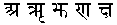 instead of the more common Delhi-Varanasi styled fonts. From a typographical point of view (not web), the best looking fonts are the “French” (called Gudakesha, as found in Bopp, 1816) and “German” (Shantipur, as found in Harvard Oriental Series vol. 14, 1914) fonts that we have created together with Tikhomirov, which have been made public at Ulrich’s website without my allowance, breaking our copyrights (the legal copy can be downloaded here). For 5 years I’ve been looking for each of more than 500 more common ligatures in the Sanskrit books published in Paris, Bonn, Oxford, to find every sign.
In late 2005 the fonts were still not finished, in 2006 they were hinted by Mihail Bayaryn (a private OpenType version was made) and the fonts have never been finished. They are replicas of old book fonts. You can see the history of making of both the fonts at Nagari Sanskrit Group and the second Devanagari font as well, also a specimen.
To put it in a nutshell. If you need an easy-to-type font – Sanskrit 2003 is the one to choose (forget about Mangal installed on Windows XP by default, it’s for Hindi, not for Sanskrit), but if you want to have the Indian flavour – use the unfinished fonts by Marcis Gasuns & Tikhomirov hinted by Mihail Bayaryn, having some of the missing characters from Ancient Sanskrit 98. If you have any questions, feel free to ask.
