Can anybody decipher the writing on this pendant, or identify the symbol on the right, which comes from the Wikipedia logo? Both were sent in by visitors to Omniglot.
Well, to me it just looks like Arabic, but it’s not really like one. Maybe the maker tried to mimic the style. Beside that, the calligraphic style doesn’t match the ones I know already.
As for the symbol on the right, I checked the logo just now and the only closest symbol to this one, as I see now, is the katakana “Wi”. But nothing exactly like this symbol on the logo now (!?)
Just another notice but still I don’t think it is significant. On the pendant, the last line on the left end of the supposed word, looks like the curvatic Alif used in the Syriac script. But again, I don’t think the writing has any significance.
I think this likely probably is a styllised version of “Allah” based on an already stylised model and executed by someone without a training in/knowledge of Arabic calligraphy.
A big argument for this is the double curve on top, which looks like a stretched, mis-executed version of the ‘shadda’ mark that nearly always written above the two laams in “Allah”. The curved onset is very similar to a horizontal stroke that begins ‘alif in some Kufic styles, and the off-stroke, despite the unusual curl or loop, is very similar to many versions of final haa’. The fact that what looks like a possible ‘alif is attached on its left to the lnext letter seems to me to indicate, lijke the other details, that this is just the work of someone working from an already stylised model who didn’t understand the principles of the script. We’ve already seen this kind of perplexing not-quite-there metalwork calligraphy in an inscription on a wooden case obtained in Malaysia that was posted here perhaps a year ago.
For Qcumber:
Actually, Muslim Chinese (Hui) developed their own very distinctive and disciplined calligraphic style (which this doesn’t look like at all):
Haji Noor Deen, a modern calligrapher, uses a style based on this “Sini” tradition, but also has his own individual style that reinterprets rotated Arabic script with traditional Chinese stroke types:
Thanks for your help in trying to decipher the script on my pendant/brooch. Two Egyptian friends (one of whom teaches Arabic at Uni.) could make nothing of it and thought perhaps it was Persian.
I don’t really find Sini style much more distorted than others. In fact distorting the shapes of letters and playing around with their placement is one of the hallmarks of most Arabic calligraphic styles, no? I find this calligraphy easier to make out than some Diwani and Nastaliq styles, and certainly geometrical Kufi, by far! And I’m note even close to fluent in Arabic…
The central panel has the Basmala in fan style at the top (with ‘Allah underneath the rest of the citation) and the bottom is “jalla jalalahu”.
I rather like the diamond style calligraphy, which comes from fitting a piece into single square tiles.
I understand what you mean, but I think “deformed” is a rather loaded word with negative connotations. The letter ‘sin’ in ‘bism’ is unusually formed, with an upward then downward curve instead of the usual three “teeth”, but the way the word is written to curve up at the end is a kind of thing I’ve seen in many other examples of Arabic calligraphy. Sini style just tends to use an overall movement that borrows from the freedom of Chinese grass script calligraphy while keeping the script legible overall,unlike grass script itself.
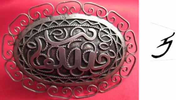
I think it says والله meaning “by God”.
It looks like لله، “Allah” but without any distinct initial aleph. The Wikipedia logo is from the Mongolian or Manchu script.
It is from Mongolian. It is ᡅ symbol.
The pendant inscription looks like a stylised ‘wallah’ – (I promise) by God. Where’s TJ when you need him?!
lol I’m here
Well, to me it just looks like Arabic, but it’s not really like one. Maybe the maker tried to mimic the style. Beside that, the calligraphic style doesn’t match the ones I know already.
As for the symbol on the right, I checked the logo just now and the only closest symbol to this one, as I see now, is the katakana “Wi”. But nothing exactly like this symbol on the logo now (!?)
Just another notice but still I don’t think it is significant. On the pendant, the last line on the left end of the supposed word, looks like the curvatic Alif used in the Syriac script. But again, I don’t think the writing has any significance.
Perhaps Bi Smi Llaah “in the name of God” imitated by someone who doesn’t know Arabic, a Muslim Chinese for instance.
@Qcumber: nah, it is so far away from Bismillah بسم الله
ِas you notice here, it is made of 2 words with a gap in between, which is not resembled here.
I was wondering…
if we put the pendant in a vertical shape, does the writing have some similarity with Mongolian?
I think this likely probably is a styllised version of “Allah” based on an already stylised model and executed by someone without a training in/knowledge of Arabic calligraphy.
A big argument for this is the double curve on top, which looks like a stretched, mis-executed version of the ‘shadda’ mark that nearly always written above the two laams in “Allah”. The curved onset is very similar to a horizontal stroke that begins ‘alif in some Kufic styles, and the off-stroke, despite the unusual curl or loop, is very similar to many versions of final haa’. The fact that what looks like a possible ‘alif is attached on its left to the lnext letter seems to me to indicate, lijke the other details, that this is just the work of someone working from an already stylised model who didn’t understand the principles of the script. We’ve already seen this kind of perplexing not-quite-there metalwork calligraphy in an inscription on a wooden case obtained in Malaysia that was posted here perhaps a year ago.
For Qcumber:
Actually, Muslim Chinese (Hui) developed their own very distinctive and disciplined calligraphic style (which this doesn’t look like at all):
http://www.chinaheritagenewsletter.org/features.php?searchterm=005_calligraphy.inc&issue=005
Haji Noor Deen, a modern calligrapher, uses a style based on this “Sini” tradition, but also has his own individual style that reinterprets rotated Arabic script with traditional Chinese stroke types:
http://www.hajinoordeen.com
TL, have you seen Arabic expressions written by Chinese Muslims? They are amazingly deformed.
TL, see what I mean?
http://www.flickr.com/photos/photopia/3413190787/
http://www.flickr.com/photos/photopia/3413960580/
According to Wikipedia, it’s from Klingon: http://en.wikipedia.org/wiki/Wikipedia:Wikipedia_logos#Alphabets_represented_in_the_logo
@QCumber: unfortunately I didn’t, and if this one is a sample, then I would be completely unable to tell what is it.
Now I see it in the logo (the symbol on the right), from the link from Ivan. It’s mongolian but rotated here.
Hello there everyone
Thanks for your help in trying to decipher the script on my pendant/brooch. Two Egyptian friends (one of whom teaches Arabic at Uni.) could make nothing of it and thought perhaps it was Persian.
I don’t really find Sini style much more distorted than others. In fact distorting the shapes of letters and playing around with their placement is one of the hallmarks of most Arabic calligraphic styles, no? I find this calligraphy easier to make out than some Diwani and Nastaliq styles, and certainly geometrical Kufi, by far! And I’m note even close to fluent in Arabic…
The central panel has the Basmala in fan style at the top (with ‘Allah underneath the rest of the citation) and the bottom is “jalla jalalahu”.
I rather like the diamond style calligraphy, which comes from fitting a piece into single square tiles.
Thanks a lot Christopher Miller, but won’t you concede the first word (bism) in the first link you give is extremely deformed?
Qcumber-
I understand what you mean, but I think “deformed” is a rather loaded word with negative connotations. The letter ‘sin’ in ‘bism’ is unusually formed, with an upward then downward curve instead of the usual three “teeth”, but the way the word is written to curve up at the end is a kind of thing I’ve seen in many other examples of Arabic calligraphy. Sini style just tends to use an overall movement that borrows from the freedom of Chinese grass script calligraphy while keeping the script legible overall,unlike grass script itself.
Amazing pendant. I love to look for these in car boot sales & antique shops
Vicki