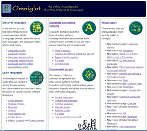
I think I’ve managed to make Omniglot work better on mobiles and other devices with small screens now. I know that the homepage goes a bit strange in IE when you make your browser narrow (not sure how to fix that), and there may be some other elements that are not behaving themselves, but it seems to be generally okay in the tests I’ve run on different screen sizes and devices. If you spot anything that isn’t working, please let me know. If you can suggest solutions, even better.

I wouldn’t worry too much about IE as I heard it’s going to bite the dust soon.
I like it so far. I find it easier to find what I need. Thanks.
That’s great. I use Chrome and Firefox, it works perfectly with both. I really like the mobile version. Well done 🙂
hey Simon,
was it hard to make the website mobile friendly? I need to do the same for my website because of the google mobile-friendly ranking update and I’ve struck a dead end. Did you use a software or did it all by yourself?
Tomislav – it took a while to work out how to make the site mobile-friendly, but it wasn’t that difficult to do. There’s a lot of information on Google: https://developers.google.com/webmasters/mobile-sites/get-started/
You can ensure that any elements (images, tables, etc) that have a fixed width in the wide screen version scale to the screen size for smaller screen. You can do this by setting a max-width of 100% and the height to auto. You also need set the viewport: https://developer.mozilla.org/en/docs/Mozilla/Mobile/Viewport_meta_tag, and make sure font sizes are relative (percentages or em’s) rather than fixed (pt, px).